
One brand, many rooms
SteveBailey.me Brand Guidelines
The Ember, the palette, the type, the header scenes, the voice, and how the whole family fits together. One shared system worn by every site — same fire, different room.
One brand, many rooms
The Ember, the palette, the type, the header scenes, the voice, and how the whole family fits together. One shared system worn by every site — same fire, different room.
The brand
Steve Bailey builds things that take their time — a boutique marketing agency grown slowly, a sourdough starter on the counter, a fire in the pizza oven, a live mix at church on a Sunday morning. The brand is the label for all of it: patient, hands-on, and better for not being rushed.
Fire is the thread through everything — the campfire at the lake, the wood-fired oven, faith at the center of it, tended not forced. The wider look borrows from the old National Park travel posters: flat vector shapes, confident geometry, a warm and deliberately limited palette, and a fine grain laid over the top so the whole thing reads as printed rather than rendered. It should feel made by hand, because that's the point.
One brand, many rooms
SteveBailey.me is one brand seen from several vantage points. stevebailey.me is the canonical home — the person and the brand. Every other property is a room in the same house: same values, same fire, its own job.
| Property | Role | Its hero line |
|---|---|---|
| stevebailey.me | The hub — the person & brand, canonical identity home | Nothing good gets rushed. |
| blog.stevebailey.me | Brand direction — major updates, where things are headed | Nothing good gets rushed. |
| peaceandgoodness.org | The day-to-day, play-by-play — the ordinary good days | Peace & Goodness in life's steps. |
| gracefillsthegaps.com | Bible teaching — scripture, one passage at a time | Grace in the everyday. |
| mychristiantruth.com | Deeper faith — relationship, not rules | Relationship, not rules. |
| strategiconlinecorp.com | The boutique marketing agency (Organization; Steve = founder) | — |
| nowvalues.com | The commercial arm — recommended tools, courses, books | — |
The mark
The logo is fire. The Ember is a single flame over two logs. It reduces to a silhouette that still reads at sixteen pixels and in one colour — the only test a logo really has to pass. Coral outer flame, gold inner flame, two brown logs. Never recolour the flame outside the palette.
Each shape has a job. Use the colour version wherever the background allows; monochrome exists for one-colour printing, embroidery and engraving — not as a style choice.


Clear space: keep a margin equal to the height of the flame on all sides, and put nothing in it.
Minimum sizes: icon 16px / 8mm · primary 120px / 30mm · square 100px / 25mm · wordmark 140px / 35mm. Below these the tagline stops being legible.
One fire, many names
Every site in the family carries the same ember mark. Only the name changes, and a single gold accent unifies them. Each site also has its own theme accent — used for its site chrome and its header scene, never for the fire itself.


Palette
The whole family shares one palette. Cream is the default ground, navy the anchor, and coral the flame's accent — used sparingly so it keeps its punch. Sun, fern and coral double as the three per-site theme accents.
Typography
Display is Anton; everything else is Nunito. Both are free (Google Fonts) and self-hosted across the family — no hotlinks.
The good stuff stays handmade.
Around the Fire — 01
I'm Steve Bailey, in no particular hurry. I'm a husband and a father. I love my church, my family, and my friends.
One landscape, many vantage points
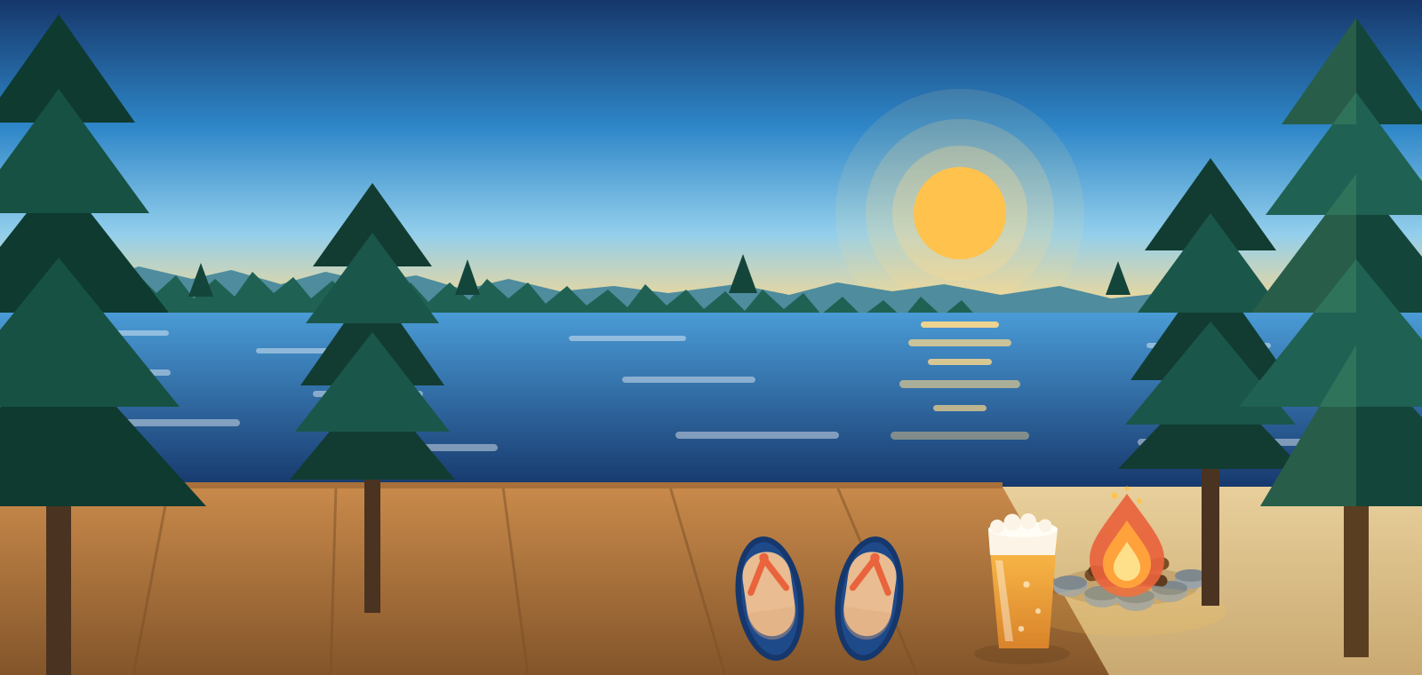
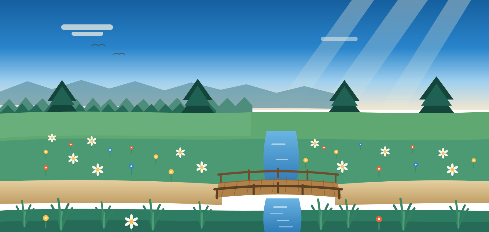
Every site opens on the same illustrated world — same lake, mountains, pines, palette and type — seen from a different spot at a different hour, each with its own hero line and lead colour. The footer unifies the family; the header differentiates each room.


Making new art
The family's illustrations are hand-built flat-vector SVGs, and anything used as the brand — the logos and the header scenes — comes from the vector kits. But when you need a quick one-off — a header for a blog post, a seasonal spot — you can brief an AI image tool (Higgsfield, Midjourney, and the like) or an illustrator with the style below. Treat the output as an editorial raster, not a logo.
Paste this, then fill in [SUBJECT] and [TIME OF DAY]:
Voice
Warm, unhurried, plain-spoken. No hype, no jargon, no exclamation-point energy. Faith is relationship, not rules. Write the way you'd talk to a friend on the porch.
“The good stuff stays handmade.” Goes on logo lockups, footers, cards, bios — across every site, unchanged.
Each site's own headline: “Nothing good gets rushed,” “Peace & Goodness in life's steps,” “Grace in the everyday,” “Relationship, not rules.” One per site — don't mix.
Application
The family shares one web system. A few standing conventions keep the sites feeling like one house.
The domain, camel-cased: SteveBailey.me · PeaceAndGoodness.org · GraceFillsTheGaps.com · MyChristianTruth.com. Each carries a small accent dot in its theme colour.
Ember mark centred above the name (gold accent word) over “The good stuff stays handmade,” on navy-deep. Same on every site.
The site's illustrated scene, full-width and screen-filling, copy left over a dark scrim; stacks below the art on narrow screens.
Structure
For search engines and AI answer-engines, the family is one hub-and-spoke entity graph. The canonical Person and Brand live on the hub; every other site's schema references the same identity and cross-links via sameAs.
stevebailey.me/#steve and Brand stevebailey.me/#brand are defined in full on the hub; everywhere else references them by @id.Downloads
Every site has its own brand kit — the logo in SVG (fonts embedded), PNG and JPG, favicons, colours and type. Take the SVG kit unless you have a reason not to.